ENSA Dijon is the oldest of the seven national schools of Art in France. I've been commissioned in late 2014 to redesign its visual identity.
Besides the obvious allusion to the art world carried within the concept of frame, the definition of the word creates an interesting analogy with the purpose of the school regarding its students
(Frame: a structure that gives shape or support).
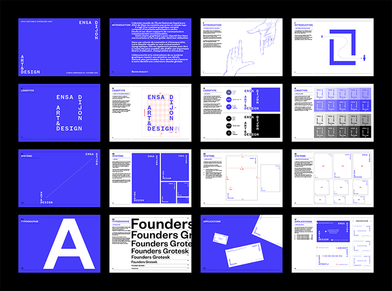
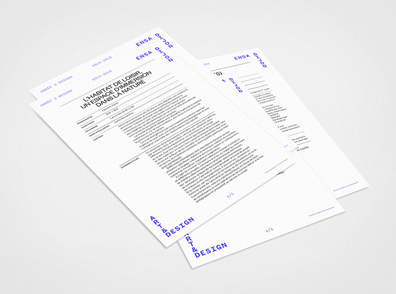
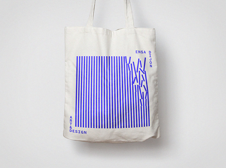
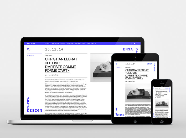
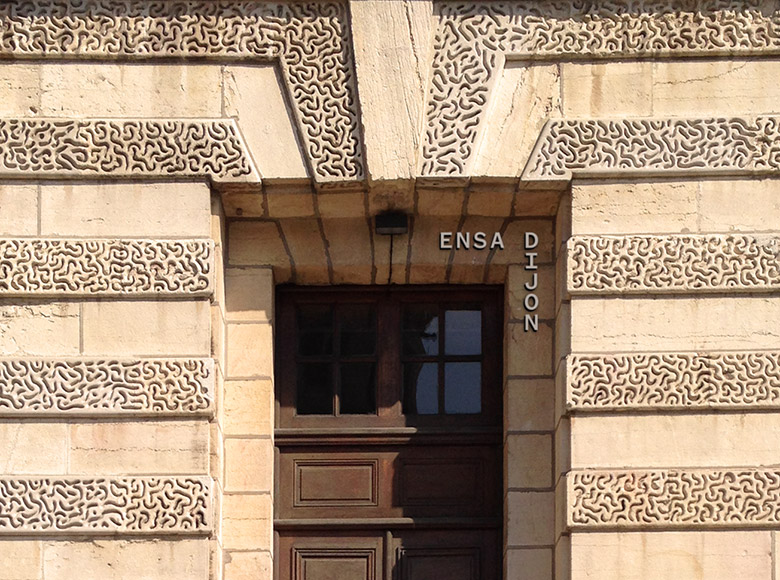
I developed a graphic system around a versatile logotype operating as an “open frame” and bringing instant recognition as well as unlimited flexibility to the school's communication.
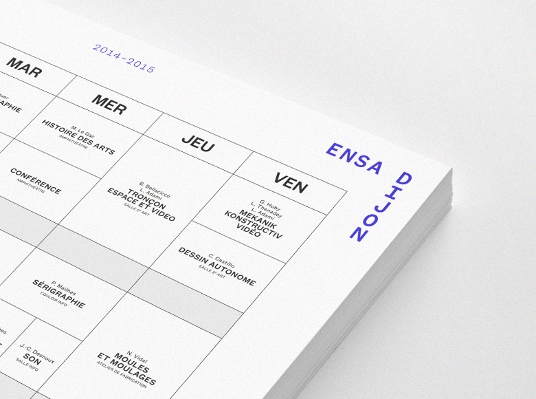
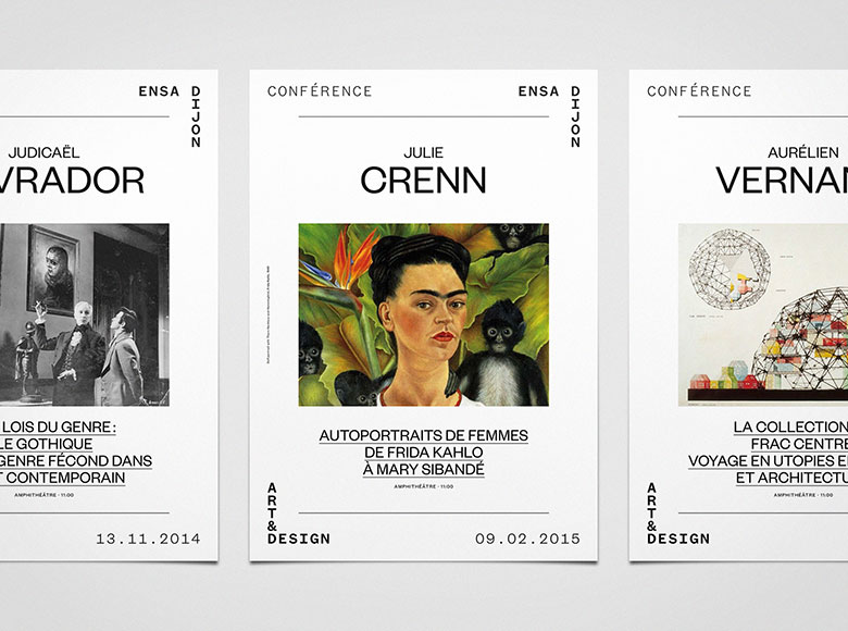
In the same way as a frame, this graphic identity has no other purpose than to highlight its content.
—
Related project → Animation, website, student guide
