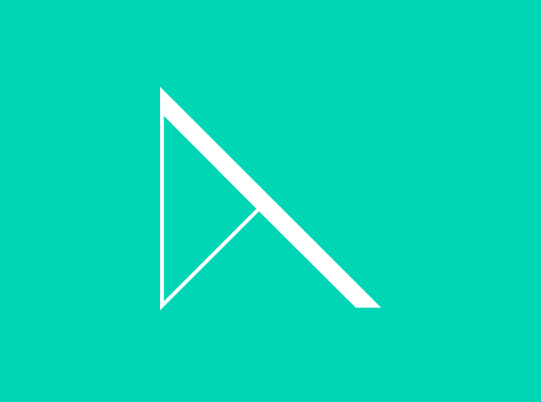
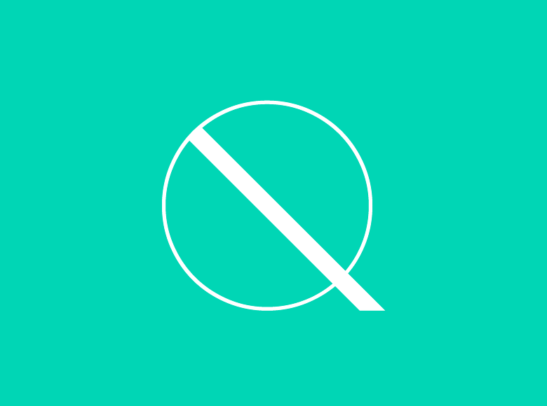
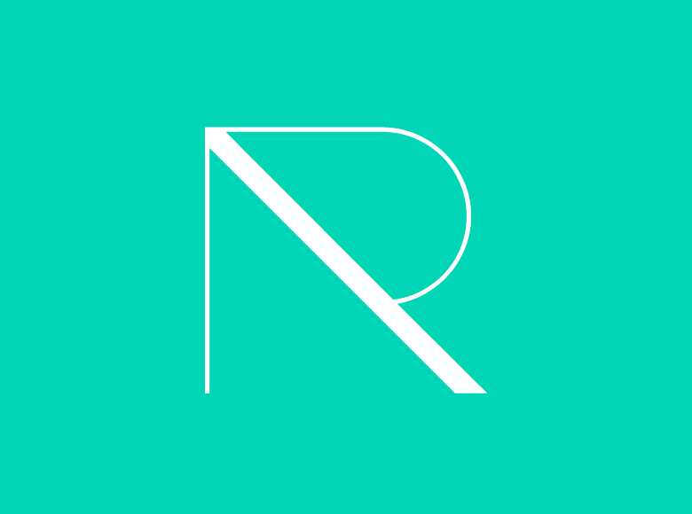
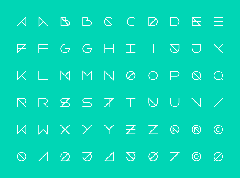
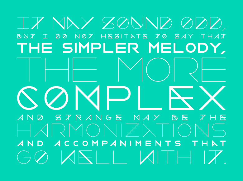
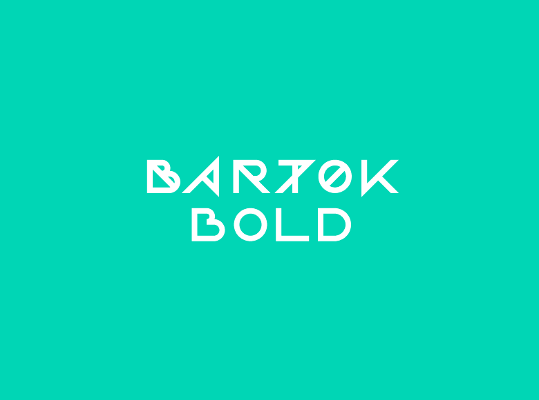
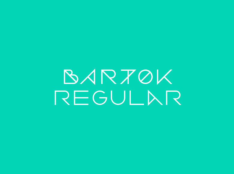
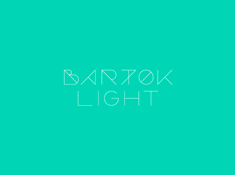
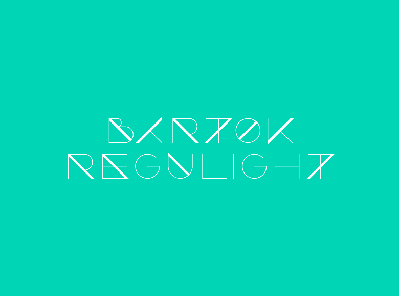
Bartok is a headline typeface I started working on while I was developping the Ray Bartok identity. I actually wanted to create a musical typeface that would visually express some sort of rhythm.
The Bartok family consists of three fonts (light, regular and bold) and an alternative version (regulight). All the glyphs are based on a very simple but strict geometric grid. But, as simple as its appearance may be, the legibility of Bartok is made tough by alternating intrusive elements.
—
Related project → Typo Lyrics
